Weekly devlog #9 - new shop ui
Hi everyone! This week I have been focusing on improving the shop UI. The old shop UI was made over 2 years ago, and I made it as just a placeholder. I never had the time to update it, and now that I am adding the witch pack to the game, it seemed like the perfect moment.
Designing the new UI
Here you can see some of my first designs. I knew that I wanted a bigger thumbnail for each item instead of a small icon, because that allowed me to better show of things like item packs. The one with the red arrow is the design I went with.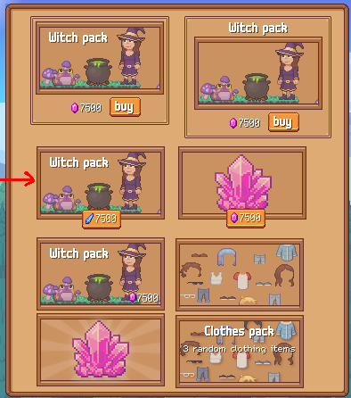
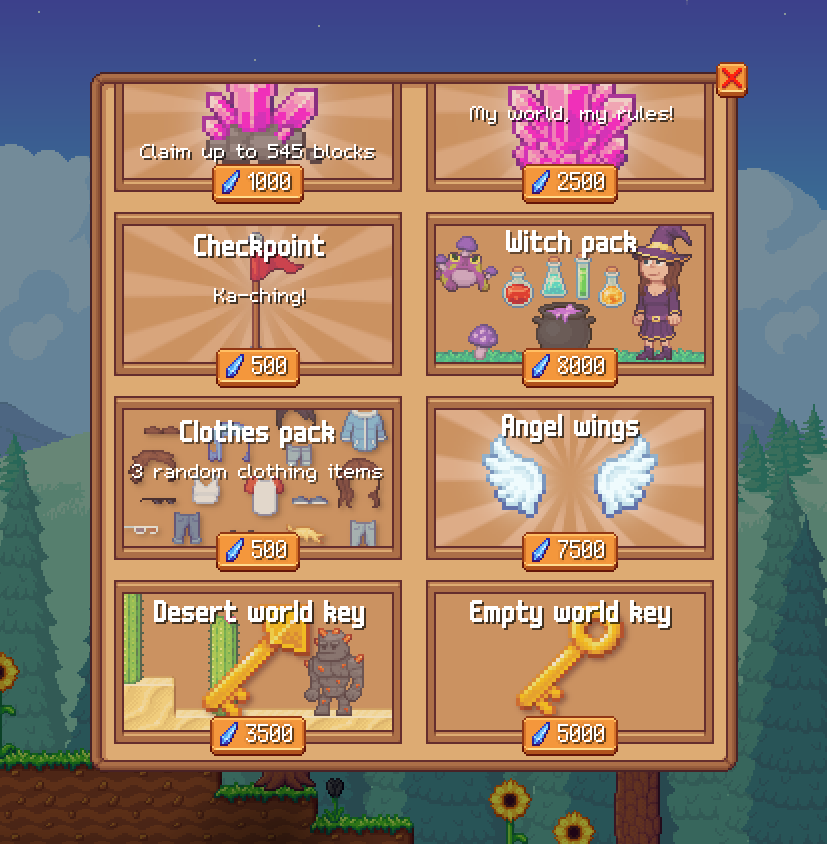
I chose that one because I prefer to keep the UI as simple as possible. I didn't choose the one below it because I think the price is not readable enough, and it is less clear that you can click on it. Here you can see how the final design looks like in the game:
Confirmation screen
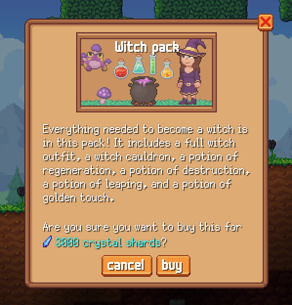
Before you buy an item/pack, it now first shows this confirmation screen. This screen also shows a description of the item/pack. These descriptions were already part of the game files, but there was no place in the game that showed them.
After you press the buy button it will show one of three screens: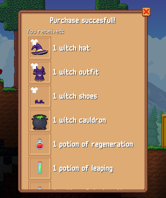
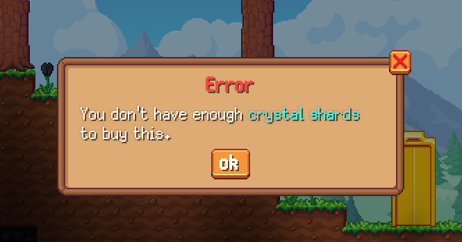
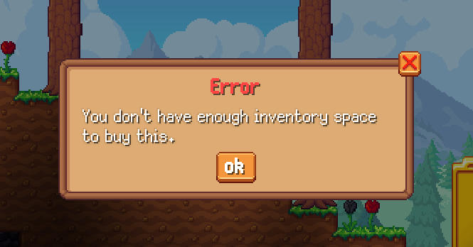
I think this is also very helpful with the clothes pack, since it will now show you which items you received:
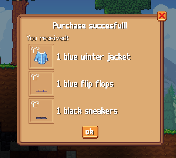
I think these new screens will improve the user experience a lot. Before this update it would not let the user know if their inventory is too full for example, and this confused a few players. And it will also prevent players from accidentally buying an item from the shop.
That is it for this week, thanks for reading this devlog!
Get Crystal Realms
Crystal Realms
A sandbox platformer mmo
| Status | Released |
| Authors | marcomeijer, Anubis |
| Genre | Survival, Platformer |
| Tags | 2D, MMORPG, Multiplayer, Pixel Art, Sandbox |
| Languages | English |
More posts
- Alpha devlog #4 - New character design + farming17 days ago
- Alpha devlog #3 - Our next big update52 days ago
- Alpha devlog #2 - Crystal Hub89 days ago
- Alpha devlog #1Aug 18, 2025
- State of the game and plans for the futureFeb 20, 2025
- Crystal realms yearly review 2024Jan 01, 2025
- Weekly devlog #29 - snow worldDec 24, 2024
- Weekly devlog #28 - New trading systemDec 17, 2024
- Weekly devlog #27 - mummy animation & upgrading bevyDec 09, 2024
- Weekly devlog #26 - Alpha FAQs and marketingDec 03, 2024
Leave a comment
Log in with itch.io to leave a comment.